Health Dashboard
A personal health analytics dashboard that pulls data from Apple Health, WHOOP, and Ultrahuman Ring into one unified view.
Why I Built This
I wear an Apple Watch. I also have a WHOOP strap. And an Ultrahuman Ring. Yes, that’s three wearables. Each one tells me something slightly different about my health, but none of them talk to each other. My sleep data lives in one app, my recovery score in another, and my glucose trends in a third.
One morning I found myself switching between three apps just to figure out why I felt terrible despite sleeping “enough.” WHOOP said my recovery was low. The Ultrahuman Ring showed my HRV had tanked. Apple Health said I got 7 hours of sleep but didn’t tell me how much of that was actually deep sleep. I had all the data but no single place to look at it together. That’s when I decided to just build the thing myself.
The idea was simple: one place where I can see everything. Heart rate, sleep stages, activity, recovery, strain, body metrics, nutrition, all from three sources, side by side. No more app-hopping. No more screenshots. Just one screen with all my data.
What It Does
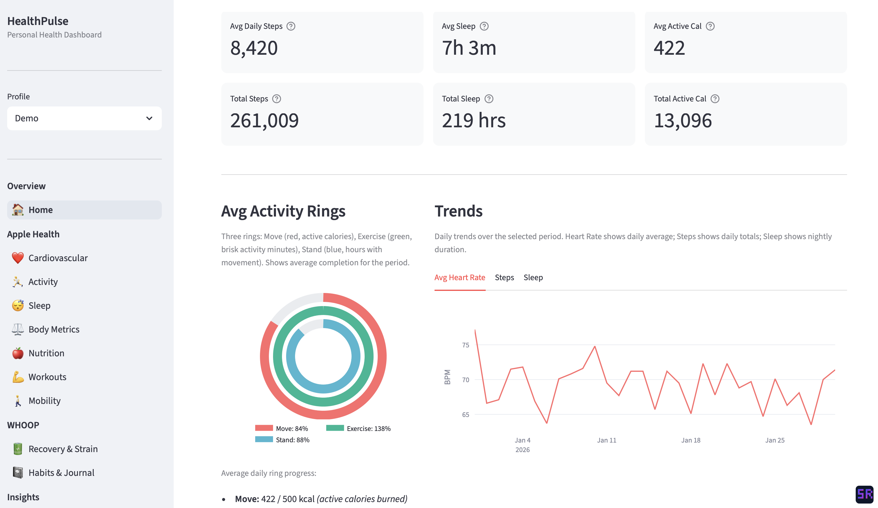
The home screen: daily overview with Apple Watch-style activity rings, key stats, and heart rate trends across the selected period. All data shown in the screenshots is anonymized and does not reflect my actual health metrics.
The dashboard has around ten pages, each focused on a different aspect of health:
- Cardiovascular: heart rate trends, HRV, blood pressure, VO2 Max, SpO2. I can see how my resting heart rate has changed over months, or compare my HRV between WHOOP and Apple Watch readings.
- Activity: steps, calories burned, exercise minutes, flights climbed. There’s an Apple Watch-style activity ring on the home page that I’m oddly attached to.
- Sleep: this is the one I use the most. It breaks down sleep into stages (REM, deep, core, awake), shows sleep efficiency, and lets me compare how different devices report my sleep. WHOOP and Apple Watch disagree more than you’d expect.
- Body Metrics: weight, body composition, BMI, body temperature. Straightforward but useful for spotting trends over time.
- Nutrition: blood glucose from the Ultrahuman Ring, plus macronutrient tracking when available.
- Workouts: workout history with a calendar view. The WHOOP data includes heart rate zone breakdowns, which is great for understanding workout intensity.
- Recovery & Strain: recovery score, daily strain, and trends over time. Super useful for deciding whether to push hard or take it easy.
- Habits: tracks things like alcohol, caffeine, late eating, and stress, then shows how they correlate with recovery and sleep quality.
- Insights: a cross-source analysis page that compares metrics from different devices and tries to surface patterns I might miss.
It also supports multiple user profiles, so each person gets their own isolated data. Useful if more than one person in the house wants to track their health.
Built with Claude Code
This entire project was built using Claude Code. I’d describe what I wanted (a sleep analysis page, a recovery trends chart, a way to import WHOOP data) and Claude Code would write the code, suggest the structure, and help me iterate. The back-and-forth felt more like pair programming than prompting.
What surprised me was how well it handled the messy parts. Health data is chaotic. Timestamps in different formats, duplicate records from overlapping devices, massive data exports. I’d describe the problem and Claude Code would work through it with me, often catching edge cases I hadn’t thought of.
It also helped me move fast. Instead of spending hours reading library docs or debugging chart configurations, I could stay focused on what I actually cared about: making the dashboard useful. The whole thing went from idea to a working ten-page dashboard in about a week and a half of evening sessions. Most of my energy went into deciding what to show rather than figuring out how to show it.
The stack, for what it’s worth: Python, Streamlit, Plotly, and SQLite. Simple and local, nothing to deploy or maintain.
What I’ve Learned About My Health
This is the part that makes the project worth it. Having all my data in one place turned vague feelings into concrete patterns.
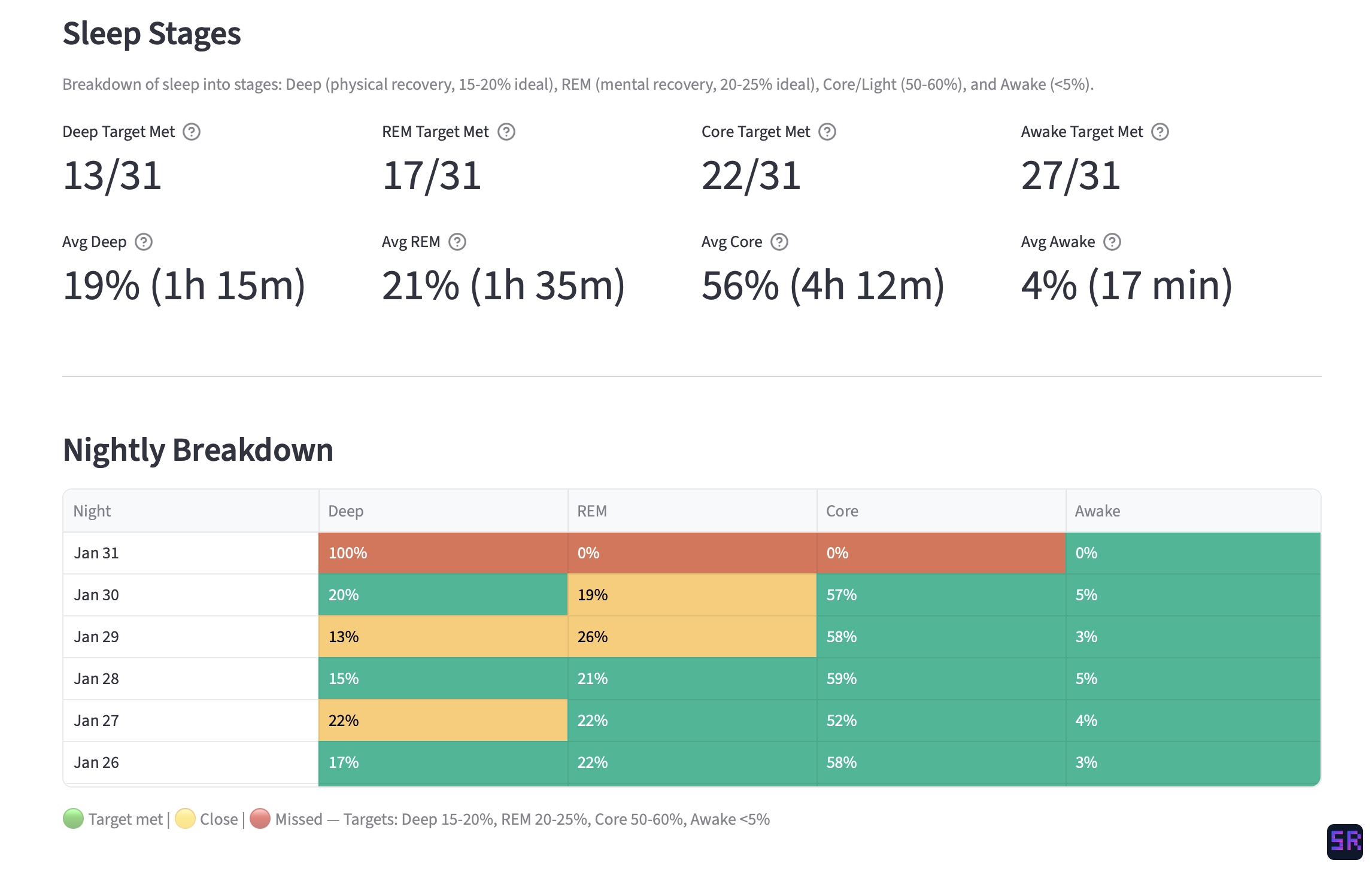 The sleep page: nightly breakdown of deep, REM, core, and awake stages with target tracking across the month.
Sleep is everything. I always knew sleep mattered, but seeing it in data hit differently. On nights where I get more than 90 minutes of deep sleep, my next-day recovery score is consistently above 70%. Below an hour of deep sleep, I feel it, and the numbers confirm it.
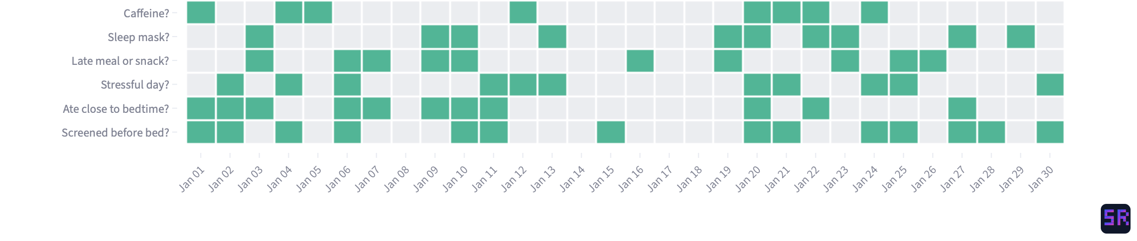 The habits page: a daily heatmap of WHOOP journal entries tracking alcohol, caffeine, late meals, stress, and other behaviors.
Late eating wrecks recovery. This was the most surprising one. Eating within two hours of bedtime drops my recovery score noticeably. The correlation was so consistent I thought there was a bug at first. There wasn’t.
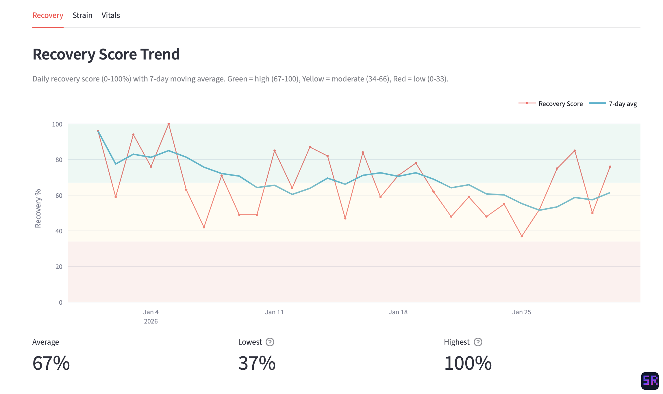 The recovery page: daily recovery score with a 7-day moving average, color-coded zones for high, moderate, and low recovery.
Zone 2 cardio is worth the hype. A week of consistent zone 2 training shows up as a lower resting heart rate and higher HRV within days. The data made me a believer more than any article could.
Devices disagree, and that’s okay. WHOOP and Apple Watch report different sleep totals for the same night. My Ultrahuman Ring gives a different HRV than the WHOOP. Having all three side by side taught me to look at trends rather than obsessing over any single reading. The direction matters more than the number.
Consistency beats intensity. My best recovery weeks aren’t the ones where I did the hardest workouts. They’re the ones where I slept at roughly the same time, ate at roughly the same time, and kept activity steady. The dashboard made this pattern impossible to ignore.
What’s Next
I’m still actively building on this. The insights page is the one I’m most excited about. I want it to surface meaningful cross-source patterns automatically rather than me having to dig through individual pages. I’m also thinking about adding trend alerts (like “your HRV has been declining for 5 days”) and maybe a weekly summary that I can glance at on Monday mornings.
For now, though, it does exactly what I set out to do: one dashboard, all my health data, no app-switching. But honestly, the bigger takeaway isn’t about the dashboard itself. It’s that the best side projects come from scratching your own itch. I didn’t set out to build a “health platform.” I just wanted to understand why I felt bad on some mornings and good on others. The dashboard was just the tool that got me there.